Blog
A Closer Look at Larry William’s Forecast 2023
Several analysts and scholars have long been interested in stock market forecasting. According to popular ideas, stock markets are simply a random walk, and attempting to anticipate them is a fool’s game. Because of the amount of factors involved, predicting stock prices is a difficult task in and of itself.
In the Review Forecast 2023, Larry Williams first discusses what cycles predict for the US in 2023 (extremely positive). He then addresses the fundamentals and the likelihood of a recession in 2023. He will also go through last year’s report to identify where I went wrong and what we can do differently in the future. Lastly, he will travel forward in time with projections for the world’s key stock market indices.
In this article, we’ll list out some top highlights you might need to pay attention to.
Planning for Trading Changes in 2023
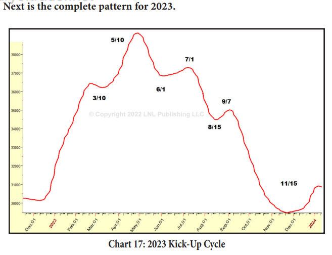
The Kick-Up Cycle predicts strength until around February 22nd in 2023. Then there should be a halt (refer to the previous charts) until the middle of March, when the second leg or wave is expected to commence.
The upward trend begins about March 10th, 2023, and continues through the end of April and the early half of May. This pattern was observed 18 times in the charts from 1950 to the present. Every single one of them properly predicted an upward trend.
The precise length and amplitude are dictated by present conditions; occasionally, such as in 1995, prices rally straight up.

Seasonal Trading Strategies for 2023
The idea behind these trading possibilities is to purchase at the start of the electronic session, hold for five trading sessions, and then exit at the first profitable opening. These are the daily sessions, or trading bars. A precautionary stop loss will be used.
The first strategy involves using seasonal patterns in the market to identify good entry points. For example, if you see a market trend from small caps to large caps and then back again over a few weeks or months, this could be an indication of a seasonal pattern that can be used to enter during a specific time period when prices are high on one side and low on another.
Another strategy involves using charts that show an overbought/oversold indicator line along with price movement as indicators for entering or exiting positions. When prices move up sharply, it could indicate that there is too much buying pressure on one side of the market; conversely, when prices go down sharply but stay within certain boundaries, it could indicate that there is not enough selling pressure on one side of the market—and thus potential opportunities for buying more shares at lower prices before prices move higher again.
How to Use Individual Market Forecasts to Make Smart Investment Decisions
To begin, consider them as potential market reversal points. These are the points at which markets are most likely to reverse their present direction and are known in advance. In practice, cyclical low points perform better to identify purchasing opportunities in a positive trend. The cycle highs will identify the finest selling chances during a decline. If you pay attention, you’ll see that the market is typically in sync with the cycle… albeit it occasionally deviates. An example would be when the cycle prediction line rises but the price falls.
Because the trend is so strong during a strong up phase, there may not be much of a selloff at the anticipated cyclical downturn. These reversal points are defined by time rather than magnitude.
When price is in an uptrend, it frequently enters a holding pattern until the next cyclical low is reached. The goal of these projections is to concentrate your attention on the times when we should expect substantial market movements. Market reversals (up or down) occur at these cycle peaks and troughs.
How to Use Market Forecasts to Develop a Winning Investment Strategy
The Red Line
The red line reflects the most active intermediate-term cycles in each market. It is particularly effective in predicting the likely spots (time zones) for market peaks, troughs, and reversals in the next year.
In brief, the red line indicates when we may expect the most significant rallies and losses. The red line does not indicate the magnitude of the price change. It does not specify the magnitude. That does give us the overall time… from cycle low to cycle high, i.e. how long the move will last.
The Blue Line
This one has both good and terrible news. The bad news is that I can’t do it for every stock or commodity, at least not where it’s trustworthy and I’m confident.
The truly good news is that it performs a decent job of projecting the market’s trend or major direction. Even better, I can sometimes detect the intensity of the trend by indicating the percentage of times price has risen or decreased while this wave is present.
Final Thoughts
It’s important to note that not all trading strategies are effective, nor are they all reliable. The main point of this report is to aid in your decision-making process when deciding on a trading strategy for yourself and your stock portfolio.
It’s easy to lose sight of what we’re going to learn from a specific stock. When you buy a stock, that means you’re buying a partial ownership in that company. The dividend payments you receive have to correspond with your ownership. So, the problem with some pundits is this isn’t transactional. They own specified shares by virtue of their work at that particular firm.
To further clarify, these are dividends they are receiving because they hold certain stocks in companies where they currently work. It is important to understand which class they hold and how much money they earn out of the total dividends stemming from different perspectives (index, sector, specialty).
>>>You can find out more via this report: https://centcourse.com/product/the-forecast-2023-by-larry-williams

